Do You Know How To Design A Retail Website?
Executive Summary: Meet Karla
Karla is part of a 6 person ecommerce team responsible for managing the webstore of a large sporting goods retailer. As part of her wide array of work duties, Karla is in charge of the site’s homepage images, content blocks, and product features.
During a monthly marketing meeting, her CMO casts a glace at Karla and says, “I noticed our pages per session, bounce rates, and time spent on site have all seen decreases in performance over the past 30 days when compared to the same time last year. Any hypotheses on why that may be?”
After a pause, Karla replies: “None immediately come to mind, but I know we haven’t been as strategic as we probably should be when it comes to testing and updating the site’s home page. I recently read an article that said over 30% of search traffic lands on the homepage first. Perhaps we can schedule a time internally to review our strategy and come up with a better game plan to rectify these gaps in performance going forward?”
“Love it, let’s make it happen,” the CMO fires back, and Karla begins to think about the journey to revitalizing the brand’s web presence that she’s about to embark on.
Importance of a Homepage
The homepage is a vitally important piece of any well-functioning online storefront. The homepage often serves as the first touchpoint for users coming in through search channels, meaning that it is your first and sometimes only chance to make a strong impression on new prospective customers. The best online shopping experience always starts with a beautifully designed front end for your ecommerce website. For repeat users also coming in through search or via referral links to the homepage, it is also a cheap and incredibly effective opportunity to present fresh content, highlight products, and feature deals or promotions.
eCommerce Web Design Features
What should a good ecommerce website include to maximize its homepage UX?
There are a plethora of homepage strategies and content modules therein that you can employ while building your custom ecommerce website to encourage users to take desired actions as they browse your store. While the list below details many website design principles for ecommerce, it is always important to note that testing and experimenting with your strategy is key to finding what performs. A feature that works great for one company’s goals and vision may not work for another–and depending on your brand positioning, the features you focus on when building your homepage can be adjusted to support key company initiatives.
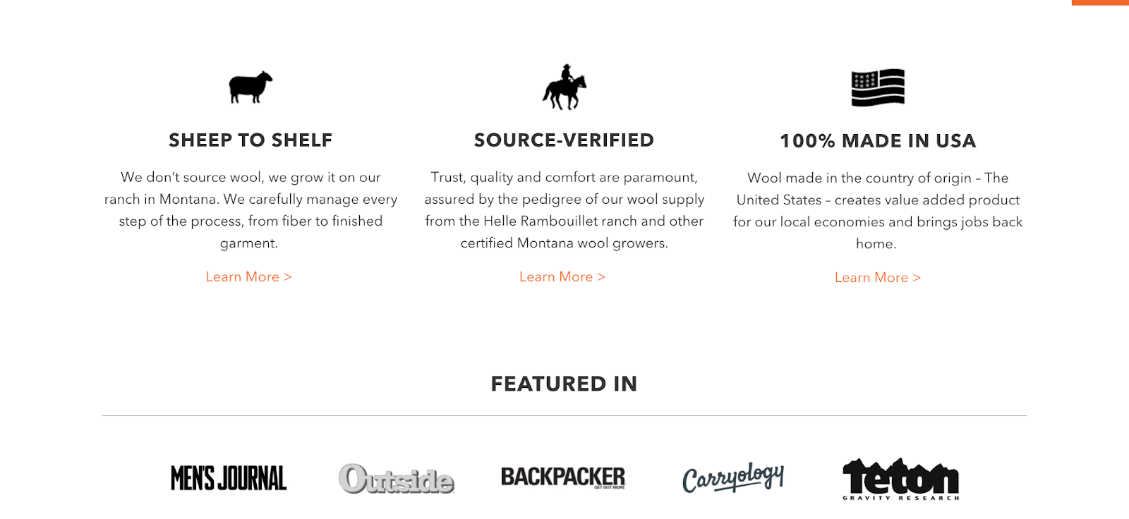
For example, our client Duckworth opts to focus on their sustainably sourced and produced fabric and ethical labor practices on their homepage rather than call out price drops or items that are on clearance. This is because their target audience is likely to care deeply about supply chain transparency and knowing where the clothes they buy came from.
In this sense, treating your homepage (and site as a whole) as an ever-evolving prototype can be a great way of thinking as you go through this process.
Let’s dive into the key components of your landing page and online store design as a whole.
What should a good ecommerce website include?
- Banner or Hero Image – The homepage banner image is a commonly utilized feature that allows a site to feature lifestyle shots of product, newly added products, sale items, or popular sellers.
- Merchandising Zones – This type of section is a great way to feature specific products you wish to promote more heavily. Being highly data-driven when choosing and testing products to feature in these zones is particularly important, both here and also within the next element (product collections).
- Product Collections – Collections are similar to merchandising zones, but they utilize groups of similar products or product categories rather than individual product feature blocks.
- Email Opt-Ins – A key goal of your homepage should be gaining permission to continue the conversation with site visitors. The easiest way to do this is by encouraging anyone casually browsing the page to sign up for your mailing list or give you their email address.
Looking At More Clothing Website Examples
Upon scrolling through Duckworth’s homepage once more, we should now be able to observe all of these elements in action.
Below, you can see that the first thing users are greeted with when they go to the site is a banner with rotating lifestyle images.

Immediately below the banner lies the next section, a merchandising zone currently highlighting some of their seasonal bestsellers.

Following these products is a list of the brand’s main product collections, which they have categorized by fabric and weight, as seen here.

Lastly, some users are greeted with pop-ups on the homepage in an attempt to funnel them into an email opt-in. Below is one instance of these pop-up windows, in this case an explanation of Duckworth’s referral program with an incentive for the customer to engage further by providing their email.

Factors To Consider When Designing An Ecommerce Website
Before jumping straight into testing the above strategies blindly, there are some important differences to note that might have a big impact on how you structure your online store for maximum usability. You want to ensure that your ecommerce homepage design is fully set up to deliver the best online shopping experience possible. Provided here are some considerations to get the juices flowing, but the list below is by no means an all-encompassing checklist. The amount of different variables that affect your onsite strategy is vast–once again, that’s why testing often and quickly is a vital part of knowing how to maintain an ecommerce website.
- Your ecommerce Platform & Its Functionality – First things first, you have to have an understanding of your hosting platform and its intricacies. This includes things such as how easy it is to swap page content around, what custom features are available to you, and how you can extract your data for analysis.
- Desktop vs Mobile Experience – Mobile users are more likely to be quickly scanning products and often convert later on desktop, so consider making products more prominent in your mobile layouts.
- Desired Actions You Want Your Users to Take – For example, if a key initiative internally is building your email list, you may want to use more prime real estate to seek out opt-ins rather than using all those pixels to show off product.
- Inventory – Featuring products with low inventory is a big mistake, as they will sell out quickly and customers clicking through to those products from the homepage will indubitably be disappointed when they see something they wanted to buy is out of stock.
Common Mistakes To Avoid
Team Tadpull has the advantage of managing a variety of different ecommerce homepages that we are able to test a wide array of strategies on. Using that experience, we’ve identified 3 common mistakes we see lots of marketers and ecommerce managers make when it comes to their homepage UX.
Mistake #1 – Not Testing Additional Homepage Features & Strategies
All too often, we see clients using the “set it and forget it” approach to their homepage–the strategy that made Karla culpable for a major dip in onsite performance. This is not to say your banner images need to be refreshed daily–or even weekly, depending on your team’s resources and/or product turnover rates. However, your website should continuously be examined and refined to find ways to improve the user experience. Testing things like calls to action on your banner overlay, product differentiation in merchandising zones, or which features you want to utilize on the homepage and in what order (social feeds, product collections, etc.) are all great strategies to play around with as you teest.
How to avoid it: Ensure that one member of your team is responsible for running at least one test of new features in your site strategy per month (or more often, depending on capacity) and leveraging the results to improve performance. Using seasonal trends, promotional sales, or new product imagery can be a good excuse to test different arrangements and see what works best.
Mistake #2 – Devoting Valuable Homepage Real Estate for Poor Products
Another mistake we see made commonly is devoting precious space in merchandising zones and product collections to illogically selected products or categories. You wouldn’t want to be promoting warm sweaters in your merchandising zone in the middle of July. Consideration of overall product performance, seasonality, and inventory availability is paramount to the success of your homepage sections–and also your ecommerce site as a whole.
How to avoid it: Cross-check your highlighted products/categories with the amount you currently have in stock, seasonality trends, and inventory turnover history before putting them in a featured section on your site so you can make sure customers won’t be disappointed when they click through to the product’s page.
Mistake #3 – Having Too Many Features and Content Blocks
Lastly, as marketers, many of us have the tendency to want to go as feature-rich as possible to drive conversions. In many instances, however, we’ve seen time and time again that less is actually more when it comes to your homepage. Essentially, you want it to be as easy and straightforward as possible for users to find and purchase their desired products straight from the landing page of your store. Every minute that a user spends in a seemingly endless scroll through impertinent content is time that they could have spent being funneled directly to relevant products that they can purchase in seconds. Striking the balance between having a content-rich homepage while also not being overwhelming and deterring visitors from ultimately purchasing is the sort of ecommerce nirvana we are searching for here.
How to avoid it: Ensure that your products are categorized clearly and logically and the hierarchy of classification is easy to navigate. Aim to add refining factors to product category pages, such as size or color, and sort options like ‘best selling first’ or ‘price: low to high’ to make it simple to find what the customer is looking for. Moreover, you should aim to pare down the steps in your checkout process to make it as fast and painless as possible so you can avoid high rates of cart or checkout abandonment. Plus, it never hurts to ask the user themselves: try sending a survey on the usability of your website to friends or past customers to get their direct feedback.
Managing The Homepage on NetSuite SuiteCommerce Advanced Websites
Changing The Main Slider Through NetSuite Interface
For users on NetSuite SCA, managing your homepage content is done through the NetSuite interface in out-of-the-box implementations.
- To access the controls, login to Netsuite and go to Setup -> SuiteCommerce Advanced -> Configuration.
- From here, choose the appropriate website and domain these changes should apply to.
- Next, navigate to the “Layout” tab to access the home page content controls.
- From the Layout tab, use the “Carousel Images” subtab to add images to the featured slider on the homepage. The order the images appear on site are determined by the order URLs. (An important note here is that the image you are using MUST live in the file cabinet in the website hosting files -> live hosting files folder. A developer will be needed to format the added images to fill the entire carousel.)

Something that often causes users trouble is knowing what exactly to put in the URL field. Rather than inputting the entire image URL, use the file path, starting with website hosting files like shown in the below example, where any subfolders of site->home are set up for organization. Further, using the UTM %20 placeholder for any spaces within the URL will ensure the image is configured correctly.

Changing Lower Featured Images Through NetSuite Interface
Now let’s take a look at how to edit the pictures for the three lower featured images.
- Access the next subtab over from Carousel Images, titled “Bottom Banners Images”.
- From here, use the same steps as before with the carousel images to manipulate the three featured images.

Changing Overlay Text On Homepage Images
Without development customizations, editing the overlay text on both the homepage slide and the bottom banners will actually need to be handled by a developer who can hard-code your customization in the backend of the site code.
Managing Merchandising Zones and Other Home Content
Development customizations are needed in order to make additional homepage content editable through either the NetSuite eCommerce interface or Site Management Tools. It is common practice with SuiteCommerce websites to have CMS areas added through development customizations, which allow for users to add things like text, merchandising zones, and extra images right from Site Management Tools.
TL;DR
- Your ecommerce creative should be continually tested, especially your homepage UX, assets, and general strategies. #EveryThingIsAPrototype
- Making your homepage too busy can distract your users from actually making a purchase.
- Out-of-the-box Netsuite SCA implementations allow users to manipulate their homepage images, but extra development customizations are needed to format site management tools to make the homepage directly editable.
Image from: freepik