By the time you’re visiting our website, the last online store you checked out will have lost sales due to abandoned carts.
It’s a stubborn industry-wide problem in ecommerce that’s seen a fair share of innovative solutions thrown at it, from persistent reminders that conveniently fill your spam mailbox to remarketing messages that keep your phone buzzing.
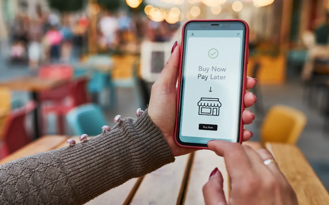
Despite these numerous attempts, buy buttons are the most promising solution.
To help explain why they are, we’ve gathered ten examples of buy buttons on profitable products pages. As we go over them, you’ll learn:
- How button placement encourages purchase completion
- How the elements around your buy buttons help reduce bounce rates
- Why the color of your buy buttons matters
- Which software can make your buy buttons more effective
But first, why do buy buttons work?
The Importance of Buy Buttons in Ecommerce
Buy buttons are a more promising solution to abandoned carts than purchase reminders and remarketing campaigns because they’re preventive.
They make purchasing easier with convenient single-click checkouts at every customer touch point to discourage cart abandonment in the first place.
For your prospective buyers, nothing triggers reneging faster than the stark realization that they’re at the very start of a multi-step purchase process. First, the signup, then email verification, and on and on before the actual check out.
This lengthy and complex process essentially counters the benefits of impulse buying to ecommerce and contributes to the ongoing industry problem of abandoned carts. For instance:
- The fashion industry experiences an average of 67% cart abandonment rate.
- The travel industry encounters an even greater 81% cart abandonment rate.
- Globally, abandoned carts cost online retailers over $4.6 trillion in lost annual sales.
Already, buy buttons have proven their effectiveness in tackling this abandonment problem. The following table highlights the massive impact buy buttons have had on some sectors through better checkout times.

Important Considerations for Effective Buy Buttons
By default, buy buttons improve your website and lead to better conversions. However, there are some visual considerations for using buy buttons that maximize their effectiveness. These include:
- The size of your buttons – Sizeable buy buttons are attention-grabbing—the larger they are, the more noticeable they become. However, your buy button will only appear large in relation to its surrounding elements, so pick a spot accordingly. Also, when dealing with multiple buttons, size is an excellent way to differentiate them and establish hierarchy. Naturally, a larger buy button appears more important and draws more attention.
- Their contrast to other website elements – Creating a contrast between your buy button and its surroundings is also an excellent way to draw attention. This contrast is possible using different colors and empty spaces between your buy button and its surroundings. Alternatively, interactive animations also create a noticeable contrast for buy buttons. They are triggered by hovering the cursor above the buy button and include color changes, highlights, or drop-downs.
- Their placement on your website – Certain spaces on your website are naturally more visible and strategic pinpoints for buy buttons. For instance, the center of your webpage is more in line with one’s gaze than the bottom left corner. Meanwhile, the top of your website is a prominent area and the first place visitors view when looking through your store.
- The surrounding elements – The components around your buy button can boost click-through rates. Usually, they’re emotive segments that generate excitement and urgency for your product, such as stock countdowns and other forms of social proof.
- Button labels – The phrasing of your button labels has a massive impact on their click-through rates. For instance, task-specific language such as “Pick your size” makes your buy buttons more compelling than a generic “Buy Now” phrasing.Meanwhile, the second-person reference of “Your size” makes your buy buttons feel specific to users and their needs, enhancing click rates.Alternatively, urgency-building language on your buy buttons can be an excellent way of adding to their effectiveness. A simple “Check out our last available slots” can be enough to get more impressions.
With these ideas in mind, let’s look at a few buy button examples from profitable product pages to understand their effectiveness.
Example 1 – CATWorkWear.com
Here’s an example of using contrast and sizable buy buttons to help draw the attention of your website visitors. Notice how the buy button is even larger than the company logo (green arrows).

Also, the black color creates a huge contrast between the “Buy It Now” button and the all-white backdrop while matching the orange-black theme of Caterpillar.
The result is a very visible buy button that’s aesthetically pleasing and emotive. A warm and welcoming orange coupled with a mysterious and intriguing black.
You need such emotional triggers for your buttons to go beyond being noticed and encourage visitors to take action.
Example 2 – OutdoorResearch.com
Here’s an example from Outdoor Research of using size to establish a hierarchy for multiple buy buttons (green arrows).

Note how the “Add to cart” button is significantly larger and more visible than the “Get $20 off,” signifying importance and preference. Anyone who views both buttons is inclined to click on the first option, which is more beneficial to Outdoor Research.
Also, notice how the buy button maintains a top placement when scrolling through the product features and reviews below (green arrows).

This is an excellent strategy for keeping the buy button in the minds of the visitors as they learn more about the product’s benefits and features.
In this way, the information about the product generates interest while the pinned buy button provides instant means of taking action.
Example 3 – Evo.com
Here’s an example by Evo of using the surrounding elements of your website to generate interest and clicks for your buy button (green arrows).

Observe how the buy button appears right under the warning “Sell Out Risk: High to Very High (1 to 2 remaining).”
The warning message is strategically written in red to signify danger and urgency, encouraging visitors to take immediate action and click on the buy button.
Meanwhile, below the buy button (2nd green arrow) is an assurance from Evo that taking action is fast and easy with same-day shipping. This assurance gives the reader another reason to take action and click on the buy button.
Example 4 – Duckworthco.com
Here’s an example from Duckworth of using color to distinguish between two equally desirable actions for your website visitors.

Both buttons are similarly sized, signifying their equal importance to the store. Adding to your cart is just as beneficial to as buying now, though different.
This difference is denoted by the different colors featured. The warm, orange color on the “Buy It Now” button nudges users towards this option without completely alienating the “Add to Cart” option.
The logic behind this strategy is that buying now closes the deal for Duckworth while adding to the cart enables deliberation despite the possibility of multiple purchases. Therefore, the preference is for the more decisive “Buy It Now” option.
Example 5 – Patagonia.com
In this example, Patagonia uses an animated buy button to draw your attention. The button inflates when one hovers a cursor over it, which sets it apart from the rest of the page (green arrow).

This animated effect is especially effective for attracting users who skim through this website and gloss over texts. The inflation effect stops these users midway and arouses more intrigue than a static buy button. In this way, the animated button gets more clicks.
Patagonia goes on to add supporting elements around the buy button. In this case, the store features a launch date (blue arrow) to help build anticipation and encourage users to join the waitlist.
Example 6 – Toad&Co.com
How about this buy button from Toad & Co that’s built around customization options to generate interest and is animated to catch your attention?

The “Add to Cart” button changes from black to white when you hover a cursor over it and conveniently appears between several customizations that encourage purchase.
There are color options, size selections, installment plans, and even a wish list to help Toad & Co understand your taste.
This buy button works because it’s visible and takes advantage of the surrounding elements that help sell the product.
Frequently Asked Questions
What’s the difference between buy buttons and links?
The main difference between buy buttons and links is their purpose.
Links are navigational tools that redirect a user to different web pages or a document, while buy buttons are enabling tools for actions within a web page, such as filling out a form.
Also, links can direct users to buy buttons, but the reverse isn’t possible.
Other than my product pages, where else can buy buttons be effective?
Buy buttons are versatile conversion-boosting tools that are also applicable on:
- Blog posts – Blog marketing is a proven advertising strategy considering that 39% of internet users read blogs. As such, blog posts are prime spots for your buy buttons, which will boost conversions by offering a direct purchase point to these readers.
- Social media pages – Generally, social media platforms consist of a significant portion of anyone’s target audience from a demographics standpoint.
This fact makes them ideal locations for your buy buttons to eliminate the extra step of navigating to your website to view and purchase your products. - Marketing Emails – Emails are important marketing channels considering that there are over 3 billion users and rising. Therefore, integrating buy buttons into your emails simplifies purchasing for this large audience and boosts conversions, making it an excellent location for buy buttons.
What are ghost buttons?
A ghost button is a type of button with a transparent body, a thin borderline, and a text label within the body.
These buttons are excellent at keeping a user interface clean and minimal, but are more likely to be overlooked than regular colored buy buttons.
Here’s a comparison of a ghost button and a regular colored button on different websites.
While both buttons are visible, the colored button on the left is immediately striking and easier to spot when skimming through the webpage. Its green color against an all-white background creates more contrast than the transparent ghost button, making it hard to miss.
Share on LinkedIn:
